
Replacing a Cluttered Mini Cart With a Focused Confirmation Overlay
TL;DR
- Problem. Kohl's mini cart had turned into a crowded container trying to confirm the add-to-bag action, preview the cart, surface offers, show rewards, and push the next step all at once. It was noisy, jarring, and hurting conversion.
- My role. Senior product designer. I owned the design call and pushed an opinionated alternative through experimentation instead of months of process.
- What changed. I replaced the mini cart with a focused confirmation overlay that did one job well: confirm the action and give the shopper a clear next step.
- Result. Validated in an A/B test. Projected to unlock up to $25M per year in incremental revenue.
- Why it mattered. It proved that product judgment and a fast test can outperform a heavy discovery cycle when the answer is sitting in plain sight, and it reset how the team thought about checkout funnel UI.
Most teams love process.
Discovery. Framing. Workshops. Ideation. Prioritization. Validation. Alignment. Then more alignment.
That process absolutely has its place. When the problem is ambiguous, unusually complex, or tangled up in dependencies, you want rigor.
But sometimes the right answer is sitting in plain sight.
This was one of those times.
The Situation
When I joined Kohl's, one of the first things that stood out to me was what happened after a shopper added an item to their bag.
Instead of a clean confirmation, the site triggered what was called the mini cart.
On paper, the idea made sense. Show people a small representation of their cart so they understand what just happened and can decide what to do next.
The problem was that the mini cart had drifted far away from that original purpose.
Over time, it had turned into a crowded container for too many competing goals. It was trying to confirm the action, preview the cart, surface offers, show rewards information, expose account context, and push the shopper toward the next step all at once.
The result was an experience that felt noisy, jarring, and strangely hard to parse.
And my reaction was simple: if I have to work this hard to understand what just happened, customers probably do too.
The Real Problem
This was not a mystery that needed months of analysis.
A shopper had just taken a high-intent action. They added an item to their bag. In that moment, the interface only needed to do two things really well:
- Confirm that the action succeeded
- Help the shopper choose what to do next
That is it.
Instead, the mini cart had become a classic example of product pattern drift. What may have started as a useful idea had been gradually watered down as more content, more goals, and more stakeholder needs got stuffed into the same space.
That happens all the time in large organizations. Nobody sets out to make something confusing. It just happens one reasonable addition at a time.
But in a conversion-critical moment, accumulated complexity becomes friction.
The Idea
Rather than trying to optimize the clutter, I proposed simplifying the interaction back to its core purpose.
We replaced the mini cart with a much cleaner modal overlay that did exactly what the moment required. It clearly stated that the item had been added to cart, showed the actual product and variant details, and offered two obvious next steps:
- Continue shopping
- View cart & checkout
That was the whole job.
No extra merchandising. No competing messages. No rewards copy. No unrelated account context. No visual chaos. No trying to do six jobs in a space that should have been doing one.
Just a clear success state and a clear decision.
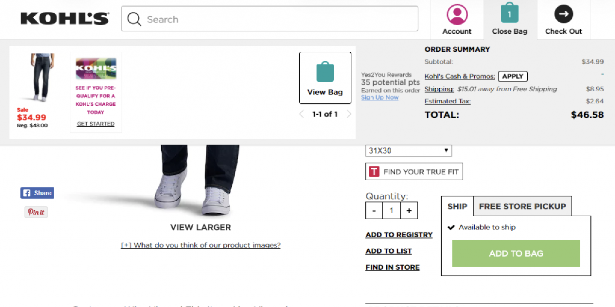 The original mini cart had accumulated too many jobs: confirmation, cart preview, offers, rewards context, and navigation — all competing for attention in a high-intent moment.
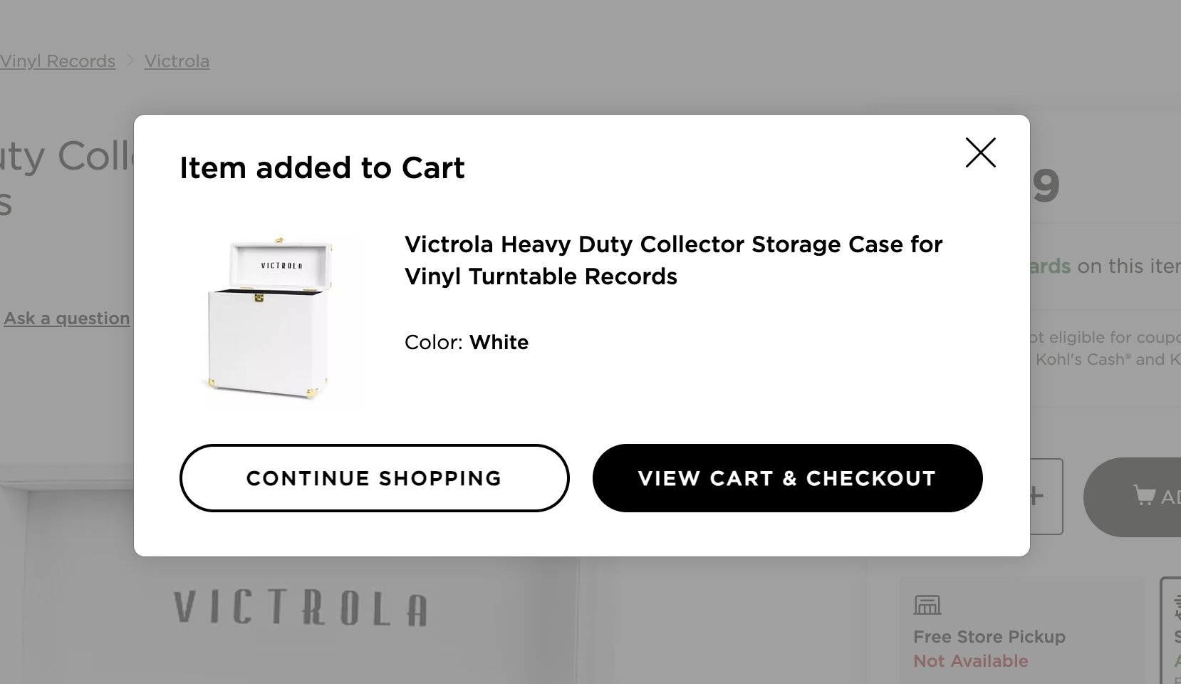 The simplified overlay focuses on what matters: a clear "Item added to Cart" message, actual product details, and two obvious next steps.
The Part That Matters Most: We Tested It
This was not a story about intuition replacing evidence.
It was a story about using product judgment to identify an obvious problem, then validating the simpler direction through testing.
I was fortunate to have a PM who was open to that approach. Working with engineering, we quickly built the simplified experience and launched it as an A/B test in Adobe Test & Target.
That piece is essential.
The lesson here is not that process is useless or that you should skip validation. The lesson is that sometimes strong product judgment lets you get to a better hypothesis faster, and then testing tells you whether you are right.
The Result
The simplified experience produced a significant conversion lift.
Based on internal estimates at the time, the annual revenue impact was in the range of many millions of dollars, with some estimates reaching roughly $25 million per year.
That is an enormous outcome for a change that sounds almost embarrassingly simple when you describe it out loud.
But that is exactly why the story matters.
The original mini cart was getting in the shopper's way. It interrupted a high-intent moment without enough clarity or focus. By reducing the interaction to its essential purpose, we helped more people keep moving toward purchase.
And one of my favorite details is that this was not just a throwaway test artifact. The simplified dialog still exists on Kohl's today in essentially the same form I designed it, which is a quiet but meaningful signal that the pattern held up over time.
What Happened When We Tried to Add More
Of course, once something wins, people start asking whether it can do even more.
We explored whether the new overlay could also support upsells or other extra content.
In practice, those additions did not meaningfully improve the concept.
The cleaner version was the stronger version.
Less was not a compromise.
Less was the advantage.
Why This Story Matters
This project reinforced something I have believed for a long time:
Simplicity is not the absence of thinking. It is often the result of better thinking.
Too many product experiences become bloated because teams keep adding things in the name of business value, optimization, or stakeholder inclusion. But in high-intent moments, clarity usually beats ambition.
Especially in ecommerce.
A retail website exists to help customers buy what they came for. When the interface becomes noisy, overloaded, or self-important, it quietly erodes the business itself.
This story is not about being anti-process.
It is about knowing when deep process is necessary, and when a problem is visible enough that the smartest move is to simplify aggressively, test it quickly, and let the results speak.
What I Actually Did
- Identified friction in a high-intent ecommerce moment
- Diagnosed the mini cart as a pattern that had drifted away from its core purpose
- Reframed the problem around clarity and next-step decision-making
- Proposed a dramatically simpler interaction model
- Partnered with PM and engineering to build and test it quickly
- Validated the change through experimentation
- Helped protect the winning concept from unnecessary re-complication
Why This Belongs in My Zero to One Stories
People sometimes hear "zero to one" and assume it only applies to brand-new products.
I do not see it that way.
Zero to one also happens when you take something muddled, noisy, and underperforming and turn it into a cleaner, more effective product move that changes outcomes in a measurable way.
This was one of those moments.
No theater. No bloated framework. No endless debate.
Just sharp product judgment, fast experimentation, and a result that mattered.