
"Retro" is having a moment. Again.
Everywhere you look, people are making games, artwork, motion graphics, and videos inspired by older eras of technology. Pixel art is back. CRT vibes are back. Low-fi visuals are back. Everybody wants that magic.
And yet a lot of so-called retro work doesn't actually look retro at all.
It looks like modern high-resolution art wearing a fake mustache.
That is usually not because the artist lacks taste. It is because they are breaking the underlying rules that made older games look the way they did in the first place. Retro visuals were not just an aesthetic choice. They were the natural result of very specific technical limitations. If you want your work to feel convincing, you cannot just sprinkle scanlines on top and call it a day. You need to build with those constraints in mind from the start.
For this write-up I'm focusing on game development, but most of the same principles apply to artwork, motion design, and even video.
Start by choosing a real rendering resolution
The first thing I do is pick a target resolution and commit to it.
Not sort of. Not approximately. Actually commit to it.
If I'm building a game, I tell the framework to render the game at a genuinely low internal resolution and I make everything conform to that. In my game Deadfall, for example, I used a 256x224 canvas, which matches the resolution used by the Super Nintendo.
That does not mean you have to lock yourself into 4:3, of course. You can absolutely make a widescreen retro game. A resolution like 480x270 works beautifully for a 16:9 format while still preserving that crunchy low-resolution look. The key is not the aspect ratio. The key is that the game is truly being rendered at a low resolution.
That part matters more than people think.
A lot of developers try to fake retro by making pixel-art-looking assets and dropping them into a modern high-resolution scene. That is usually where things start going sideways. The assets may be pixelated, but the game world itself is not following the same rules. The result feels off.
If you want the illusion to hold, the whole thing needs to live in the same universe.
The real trick is low-res rendering plus clean upscaling
Of course, if you render a game at 256x224 on a modern display, it is going to look tiny. So the next step is obvious: upscale it.
But how you upscale it is everything.
The correct approach is nearest-neighbor interpolation. That keeps the pixels hard-edged and discrete instead of blurring them together. You are effectively turning each source pixel into a larger block of pixels on the final display.
Just as importantly, you want to upscale by whole-number multiples only. That means 2x, 3x, 4x, and so on.
Why? Because anything else introduces subpixel distortion. You start getting half-pixels, uneven edges, shimmer, softness, or other artifacts that immediately weaken the retro illusion. Old displays did not render sprites with weird fractional scaling. Your game should not either.
In Deadfall, I upscale the 256x224 canvas by 3x, which gives me a 768x672 display surface. From there, the hardware can scale further if needed, but the important part is that the foundational pixel structure is already locked in cleanly.
That is how you get pixels that still feel like pixels on modern hardware.
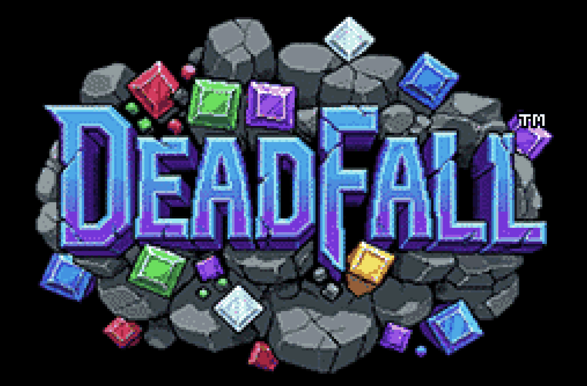 Deadfall title and logo presented in 256x224 pixel resolution
Make your artwork obey the same constraints
The same logic applies to artwork.
If your game is supposed to exist in a 256x224 world, then your art pipeline should behave as if that is the world you actually have. Not as an afterthought. Not just at export time. From the beginning.
A workflow I like is this:
Create the artwork in the aspect ratio you need, reduce it down to your actual target canvas resolution, and then reduce the color count aggressively. Think 32 colors. Or 16. Sometimes fewer.
That color reduction is not a compromise. It is part of the charm.
When you limit the palette, you naturally introduce banding, posterization, and dithering. Those artifacts are not bugs here. They are part of the texture. They help the image feel like it belongs to an older medium instead of looking like pristine modern digital art that got lazily shrunk.
That is one of the biggest mistakes people make. They keep too much detail, too much gradient smoothness, too much color information, and then wonder why the result feels wrong.
Retro style is not just about visible pixels. It is also about reduced visual information.
Sprites need discipline, not vibes
When it comes to sprites, I strongly recommend working in powers of two. For Deadfall, I used 16x16 sprites.
That kind of structure makes everything easier to reason about, and it aligns well with how older systems and workflows were typically organized. More importantly, it forces clarity. At 16x16, every pixel matters. You cannot hide behind detail. You need strong shapes, readable silhouettes, and intentional animation.
And that brings me to an inconvenient truth for the AI-everything crowd: if you want truly great retro sprites and sprite animation, expect to hand-edit them.
A lot.
AI tools are simply not very good at this yet. They do not reliably respect strict pixel grids, they drift in scale and proportion, and they are especially bad at maintaining consistency across low-resolution animation frames. They can be useful for ideation or mood, but they are not a substitute for careful pixel craftsmanship.
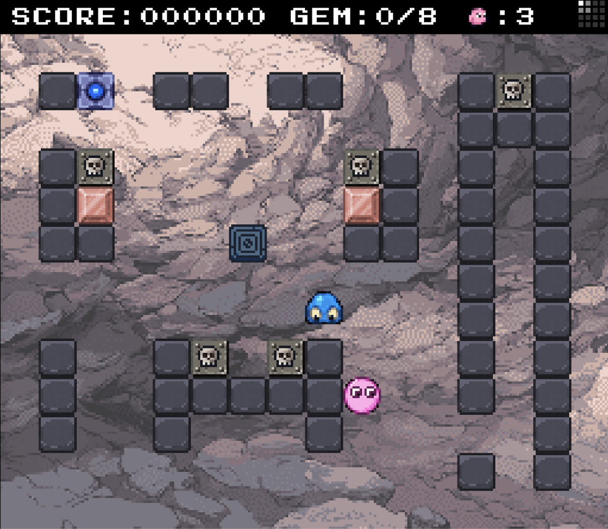
![]() Gem crush sprite sheet from Deadfall
Gem crush sprite sheet from Deadfall
If you want sprite work that really snaps, you are still going to need human judgment.
![]() Enemy death sprite sheet from Deadfall
Enemy death sprite sheet from Deadfall
Code-drawn graphics can look retro too
Not everything has to be sprite-based.
I have made games that draw nearly everything directly in code rather than relying on traditional sprite sheets. That can work beautifully. In fact, it can produce a very distinctive look.
But the same rule still applies: render it all on a low-resolution canvas first.
That is the whole game.
Whether your visuals come from hand-made sprites, procedural drawing, vector-style primitives, particle systems, or generated geometry, the thing that makes it feel retro is not the implementation method. It is the rendering discipline. Low-res first. Clean whole-number nearest-neighbor upscale after.
That is the golden rule.
The fastest way to break the illusion
If you remember nothing else from this article, remember this:
Retro style is mostly about consistency.
Once you break consistency, the illusion falls apart.
A crisp 16x16 sprite next to a smoothly rotated UI element? Broken.
A low-color scene with high-resolution lighting gradients? Broken.
Pixel art scaled by 2.75x with filtering artifacts? Broken.
Tiny hand-crafted assets floating in a world that ignores the chosen resolution? Broken.
You do not need perfect historical accuracy. You do need visual discipline.
My ground rules for convincing retro visuals
Here are the rules I keep coming back to:
1. Render everything in the same base resolution
Do not mix visual systems that clearly come from different worlds. Pick a low internal resolution and make the whole game obey it.
2. Reduce your colors on purpose
Lower color counts create banding, posterization, and dithering that help sell the era. Too many colors instantly make things feel more modern.
 Deadfall rendered in 256x224, 3x upscaled with nearest-neighbor interpolation
3. Be very careful with rotation
Rotated or slanted pixel art often breaks the illusion fast. Once pixels stop aligning cleanly to the grid, the work starts feeling more like high-res art pretending to be low-res art. That does not mean you can never rotate anything, but it does mean you should treat rotation as dangerous.
![]() Rotated pixels do not look retro. Neither do pixels that differ in size
Rotated pixels do not look retro. Neither do pixels that differ in size
4. Upscale only in whole-number steps using nearest-neighbor
This is non-negotiable. Use 2x, 3x, 4x, and so on. Anything else invites blur, warping, and uneven pixel geometry.
The finishing touch: CRT effects
And then, if you want to have some fun, you can go one step further.
I love adding CRT treatment on top.
At the simple end, that can mean subtle scanlines. At the more advanced end, it can mean a proper GLSL shader that emulates aspects of an old display: phosphor glow, curvature, bloom, shadow masks, color bleed, the whole deal.
 Vectronics in CRT mode rendered in 256x224 pixels using a CRT GL shader
Yes, it is objectively funny to spend precious GPU power making a razor-sharp 4K display look more like a slightly questionable tube television from decades ago.
But it works.
And honestly, that contradiction is part of the charm. New is old. Old is new.
If you want a head start, I have a CRT shader stack in my open-source display system, retrozone, that you can use and adapt.
Final thought
The biggest misunderstanding about retro visuals is that people think they are mostly about decoration.
They are not.
They are about constraints.
The retro look does not come from adding a few nostalgic effects at the end. It comes from choosing a limited technical language and being disciplined enough to stick to it all the way through. Low resolution. Reduced color. Clean scaling. Consistent rules.
That is the secret.
Do that, and your game will not just reference the past. It will actually feel like it belongs to a coherent visual system inspired by it.
Now go make something awesome.
Sources
-
Copetti, R. "Super Nintendo Architecture: A Practical Analysis." copetti.org. — Thorough independent technical reference confirming the SNES 256×224 NTSC resolution, 8:7 pixel aspect ratio, and PPU architecture.
-
SNESdev Wiki. "Sprites." nesdev.org. — Authoritative SNES development reference documenting all hardware sprite size combinations (8×8, 16×16, 32×32, 64×64) and OAM register specifications.
-
Wikipedia. "Pixel-art scaling algorithms." — Technical overview of nearest-neighbor as the baseline scaling method for pixel art, plus advanced algorithms (hqx, xBR, etc.).
-
Wikipedia. "Vectrex." — History of the only home console with an integrated vector display, released November 1982 by General Consumer Electronics.


